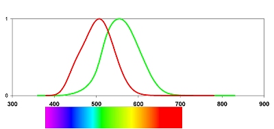
CHROMATISM (1) The most difficult aspect in representing colours on a computer screen is how do our eyes perceive color. In short we have two ways to describe the sensitivity of our eyes for different wavelengths, photopic (daylight) or scotopic (nightime) response. Both of them have different curves. In the image below the photopic curve is green, the scotopic curve is red. On the bottom a colour-spectrum is also generated. |
So where’s the complication ? So the first idea would be to simply generate startest images at different wavelengths and add them together dimming them according to the photopic or more logical the scotopic function. This is what I got at first ! |
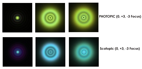
Nice colours ? Yes they are nice colours, but who would buy such a telescope ? Clearly the simulation was leading to unwanted side effects. As a next step I decided not to work with the wavefront-errors from a ‘real-designed‘ refractor but with a perfect telescope with no aberrations at all. The only chromatic effect this telescope could have would be due to the different sizes of airy-disc and diffraction rings at different wavelengths. And this is the current stage of testing |
 |
 |
 |
|||
 |
 |
||||
|
|
|
Read the next part on using a new spectrum and getting white airy-discs |